Account Selection 2.0
Re-architected account selection and validated via multivariate testing—contributing to higher new account openings.
Client
Vanguard
Services
Growth Experimentation
Cross-Team Strategy
Duration
8 Weeks
At a glance
Problem: Users struggled to compare accounts and choose confidently, increasing drop-off.
Role: Led UX strategy + interaction design; partnered with Product, Engineering, and Content.
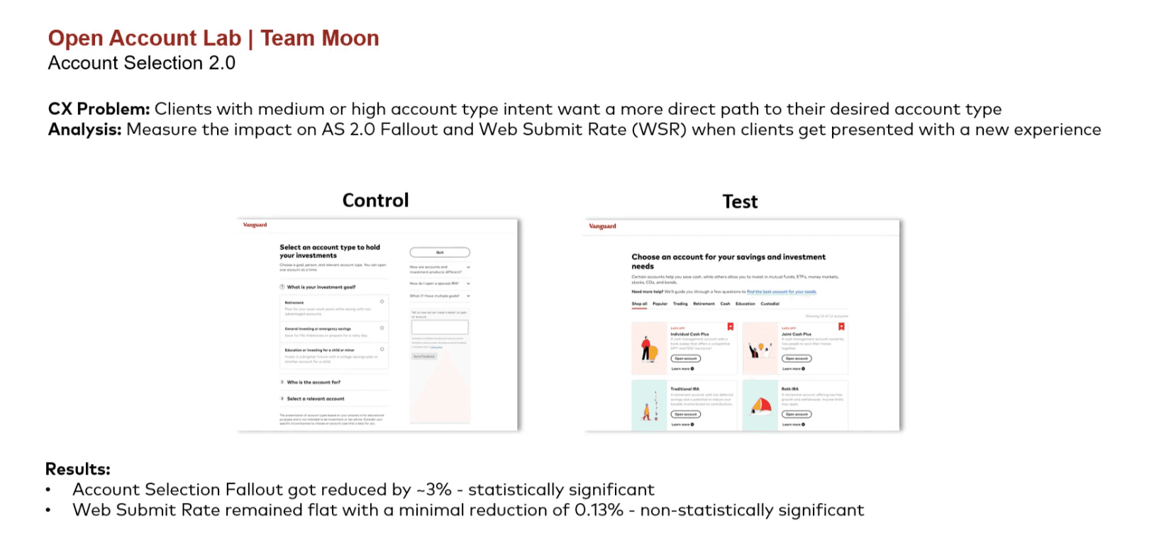
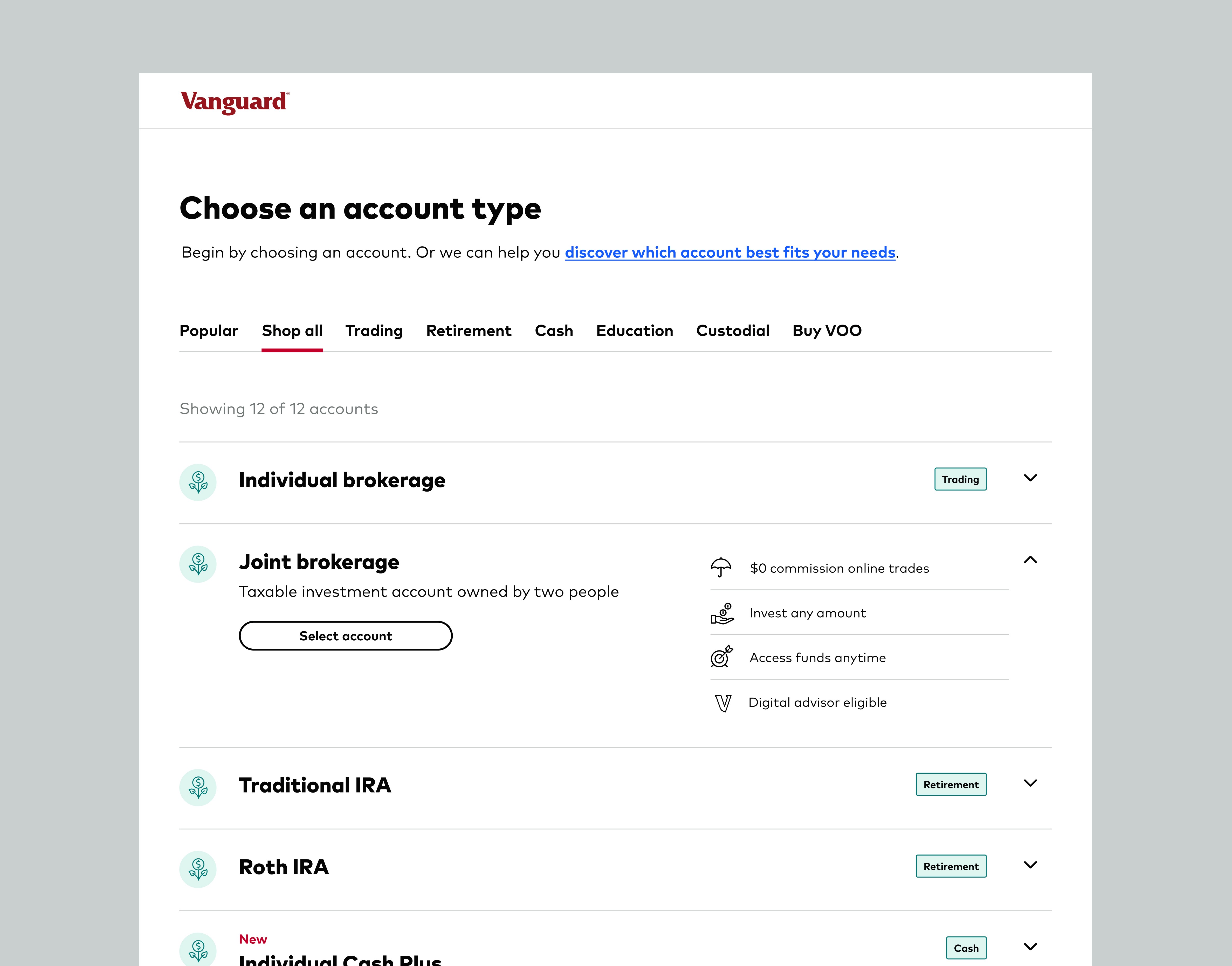
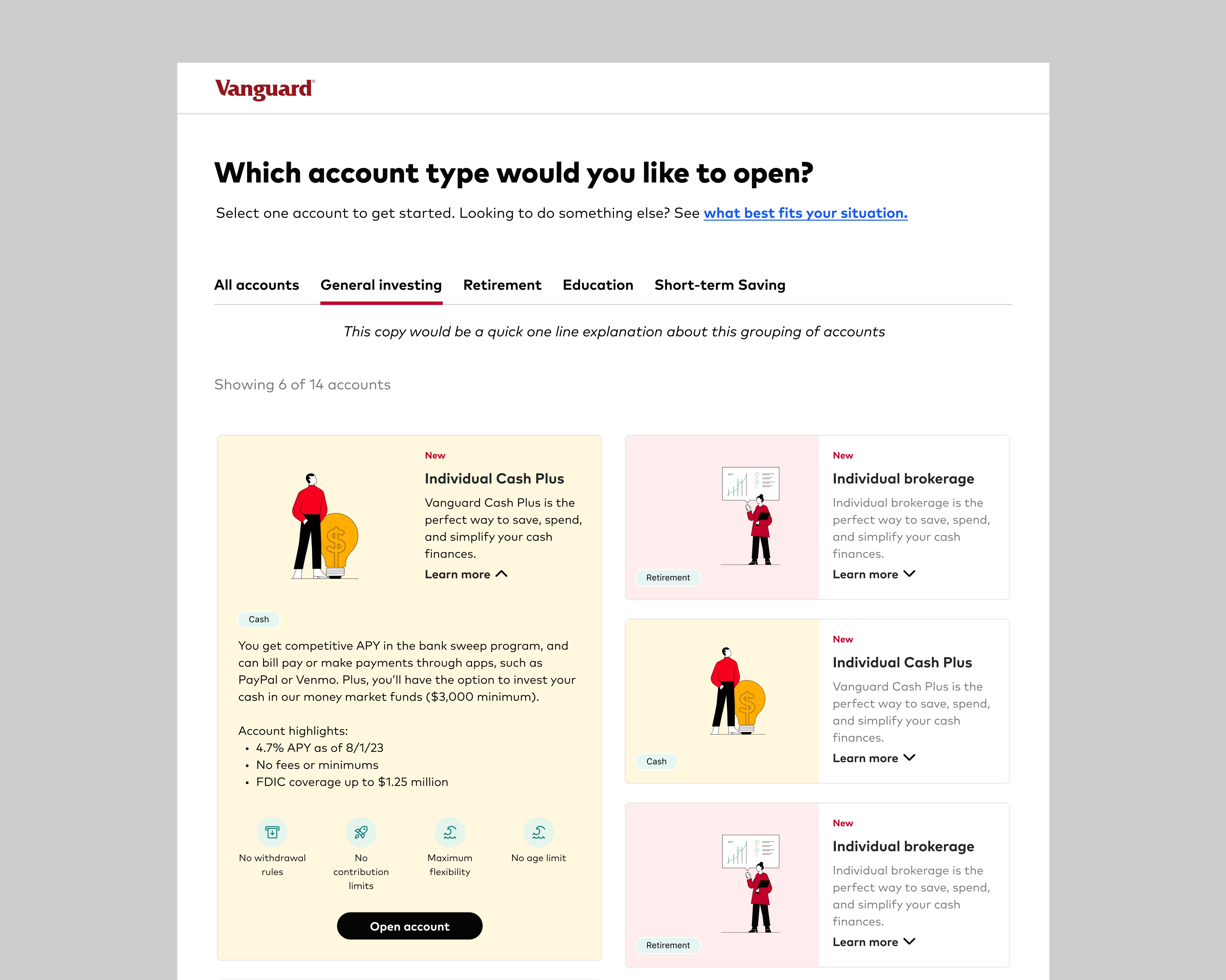
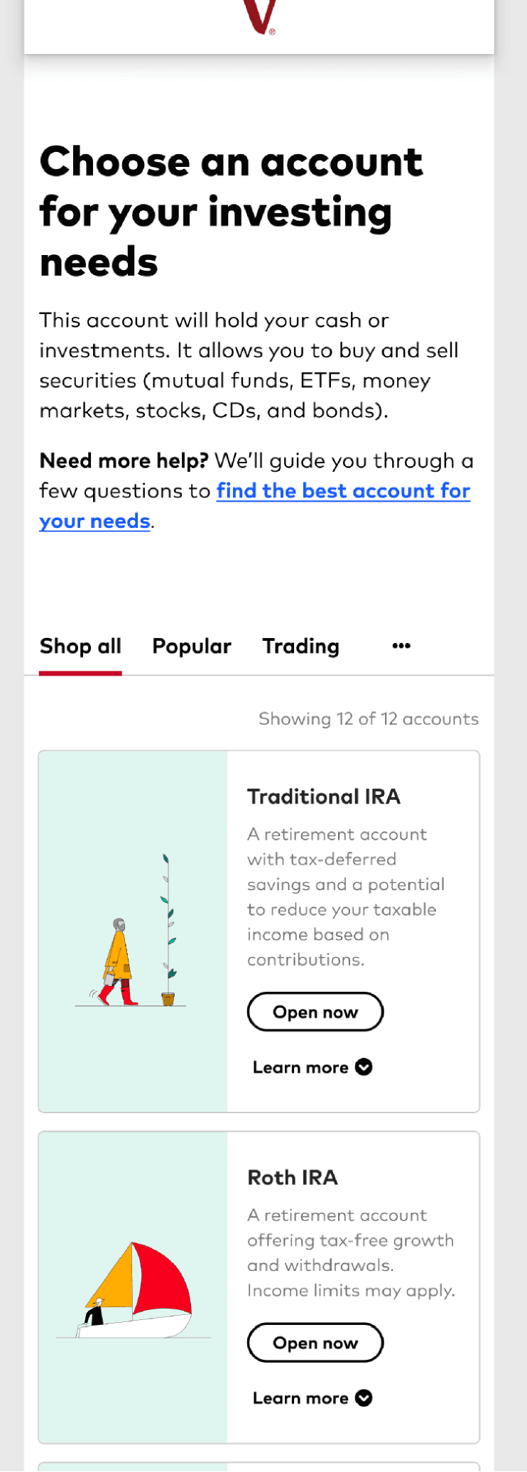
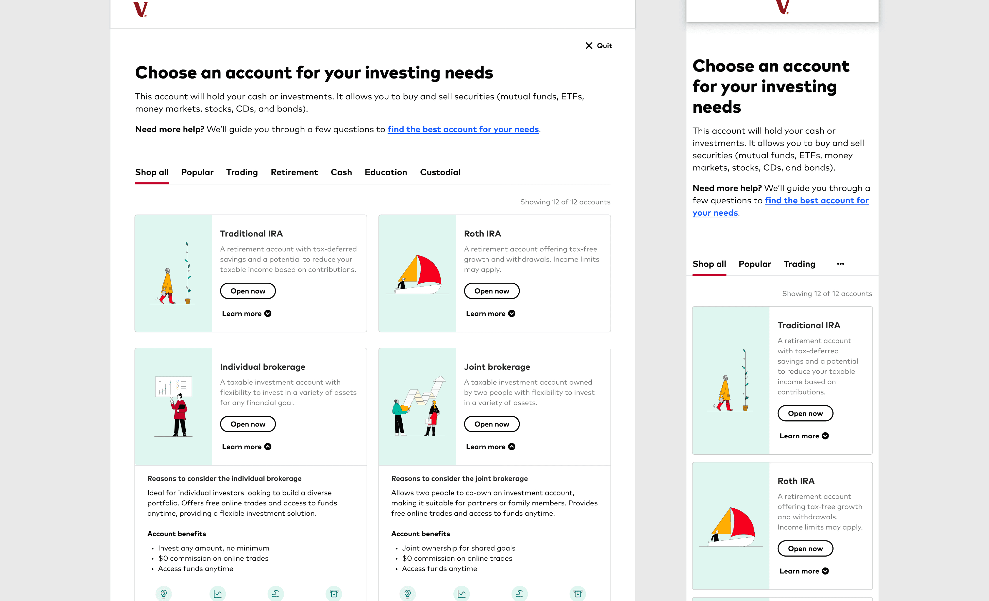
Solution: Progressive-disclosure comparison cards with lightweight filtering + an “escape hatch” to guided stepper.
Validation: 90/10 experiment to validate the pattern before scaling.
Summary
I redesigned Vanguard’s account selection step to reduce decision friction and increase investor confidence during onboarding. By simplifying comparisons and adding guided decision support within existing system constraints, the experience became easier to understand and act on—driving a measurable lift in account openings and lower fallout.
Top Metrics
+23% New account openings (QoQ)
+3% Lift in progression (90/10 experiment)
Scaled pattern across account selection
Metrics are relative; details adjusted to protect confidentiality.
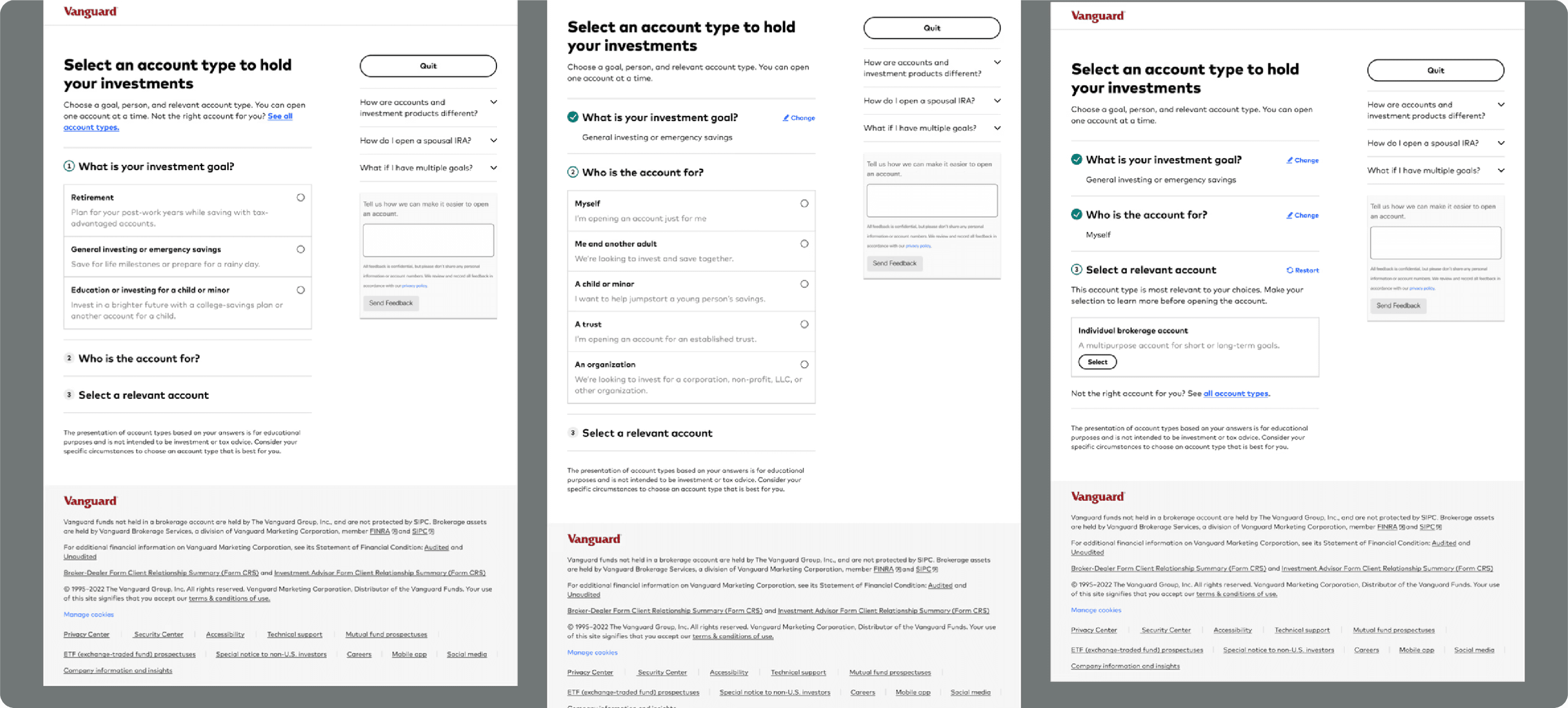
The Problem
Choosing an account is a high-stakes moment in onboarding: investors are trying to make a “right” decision with limited context, unfamiliar terminology, and fear of making a costly mistake. The existing experience made it easy to browse options but hard to decide—which created hesitation, abandonment, and increased support burden.
We needed to make the account selection step feel more like confident guidance than a menu of mystery boxes—without adding clutter or overwhelming users on mobile.
the impact
Validated the pattern with a 90/10 experiment before scaling.
Early signal: +3% lift in progression through the account selection step, which secured buy-in to expand rollout.
After scaling, the redesigned page contributed to a +23% increase in new account openings (QoQ).
What drove the lift: clearer comparison through expandable cards, faster narrowing via filtering, and an escape hatch for users who needed step-by-step guidance.