Accounts & Transfers Visibility

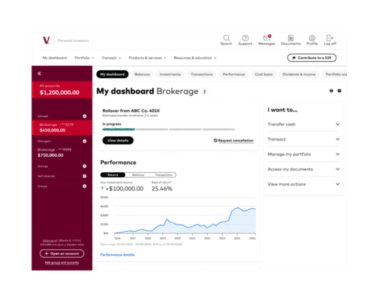
Redesigned how clients find and manage in-progress onboarding and money-movement tasks by unifying status + next steps into a consistent, dashboard-first model.

Client

Vanguard

Services

Product Design

Experience Strategy

Systems + Information Architecture

Duration

In progress (work completed to date)

At a glance


  • Problem: Drafts and transfer status are fragmented across surfaces, increasing uncertainty, abandonment, and support burden.

  • Role: Senior UX Designer leading strategy + system definition across onboarding, transfers/rollovers, and logged-in experience.

  • Solution (work to date): Unified in-progress model + scalable entry points (dashboard + nav + account-level) with clearer progress cues and next steps.

Summary
This in-progress redesign makes long-running workflows (open, transfer, rollover) feel findable, legible, and trustworthy. I’m reframing “drafts” into an in-progress ecosystem—defining shared status rules, mapping states, and designing reusable patterns that reduce hunting and help clients resume with confidence.

Top Metrics


  • Baseline: 16% draft retrieval; 9% draft completion (new account applications).

  • Research signal: ~1/3 of usability test participants are unsuccessful due to wayfinding when checking money-movement status/next steps.

  • Leading indicator: 14% in-progress status visitation rate is associated with a +2% completion increase and ~30% reduction in calls (alongside other wayfinding work).

Metrics shown are baseline/leading indicators; final outcomes will be reported post-rollout.

The Problem

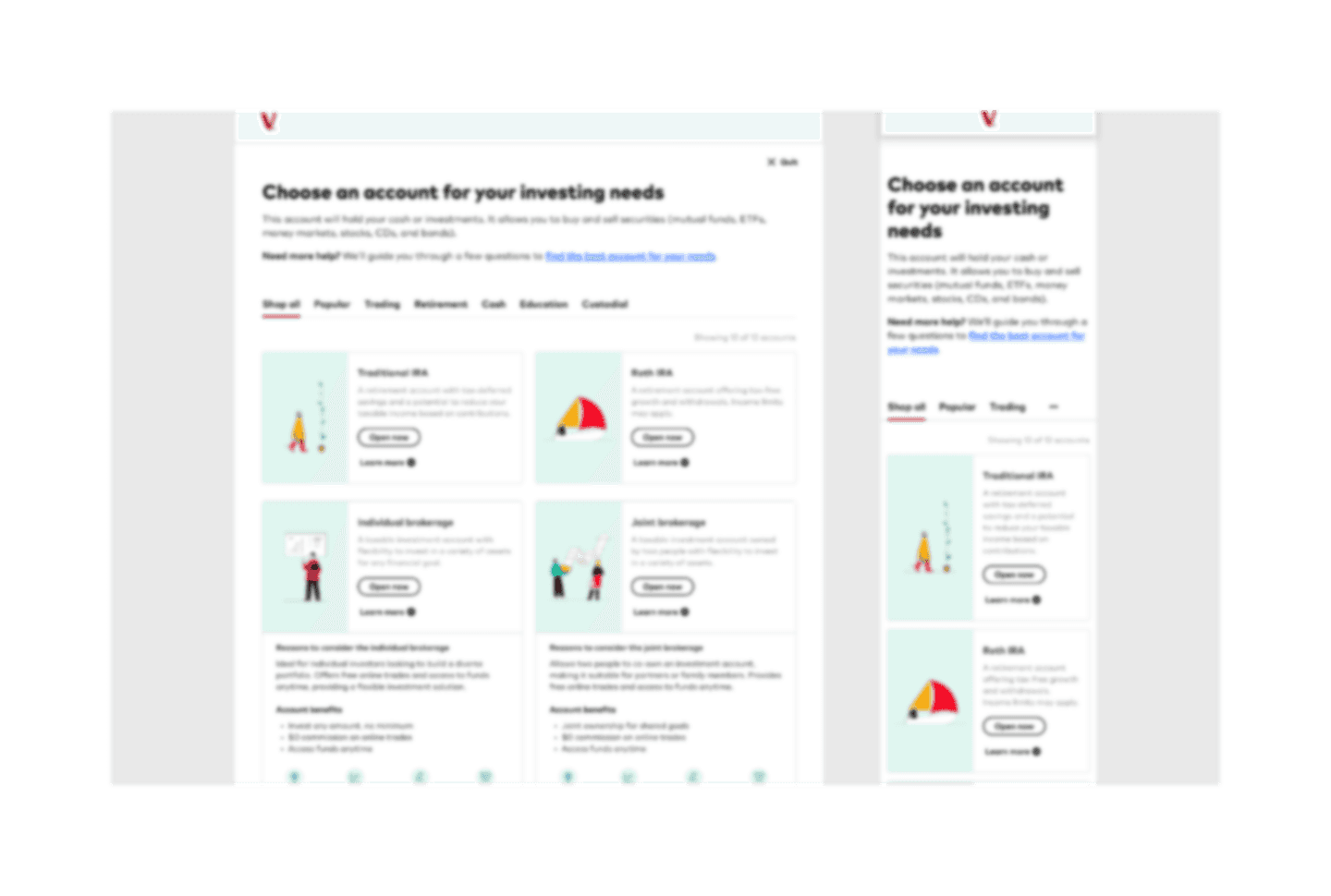
Clients expect in-progress work to be easy to find from a single, predictable place. Today, drafts and status are split across journeys with inconsistent entry points and uneven progress cues—driving uncertainty, abandonment, and support contacts.

The current retrieval pattern limits our ability to surface the best next step, provide contextual help, or communicate expiration risk consistently. In other words: the UI is a symptom of a deeper issue—in-progress work doesn’t have a shared home or shared rules across journeys.

constraints & context


  • Regulated language: Copy must be precise, compliant, and confidence-building.

  • Multi-surface system: Status appears across dashboard, onboarding flows, and transactional experiences—so the model must hold across contexts.

  • Data + rules: Visibility depends on retention/expiration policies, account type, triggers, and status field availability.

  • Dashboard governance: High-visibility real estate is constrained; the solution must align to an established dashboard card pattern.

  • Micro-frontend architecture (MFE): Because this ships as an MFE, the pattern must be integration-safe and portable—designed to work within shared contracts and cross-team implementation constraints.

Leadership & Contributions


  • Experience strategy: Reframe “drafts” into a unified definition of in-progress work across onboarding and transfers.

  • System definition: Map states and define what “trustworthy progress” requires (visibility, clarity, action, continuity).

  • Design outputs (work to date): Dashboard card widget concept, actionable progress indicator pattern, transfer/rollover state map, and in-progress hub information model.

  • Cross-functional alignment: Partner with Product, Engineering, and Content to document shared rules and keep implementation consistent across surfaces.

Validation & iterations

What I've validated (completed)
We ran usability testing on the current in-progress experience and saw consistent wayfinding breakdowns: users struggled to locate transfer/onboarding status, interpret what “in progress” meant, and identify the correct next step. A meaningful portion of participants were unsuccessful due to findability gaps when checking money movement status and re-entering long-running flows.

How I'm iterating now (in progress)
Using those findings, I’m iterating the latest In-Progress dashboard card component to align with the dashboard team’s design system card rules—including layout constraints, hierarchy, spacing, and content density requirements. The goal is to preserve the validated behavior (clear status + next step + confidence cues) while ensuring the pattern is system-consistent, scalable, and implementation-ready across desktop and mobile.

What ships this quarter (build phase)
The dashboard card is being built this quarter as part of an incremental rollout. Instrumentation is defined to measure post-release signals (status views, resumptions, completions, and support contact trends) so we can confirm the design reduces wayfinding friction and improves visibility once it’s live.

constraints & context


  • Regulated language: Copy must be precise, compliant, and confidence-building.

  • Multi-surface system: Status appears across dashboard, onboarding flows, and transactional experiences—so the model must hold across contexts.

  • Data + rules: Visibility depends on retention/expiration policies, account type, triggers, and status field availability.

  • Dashboard governance: High-visibility real estate is constrained; the solution must align to an established dashboard card pattern.

  • Micro-frontend architecture (MFE): Because this ships as an MFE, the pattern must be integration-safe and portable—designed to work within shared contracts and cross-team implementation constraints.

the impact

Status: In progress — outcomes will be reported post-rollout.

Success criteria we’re measuring

  • More clients find transfer/onboarding status from the dashboard without hunting or calling support

  • Increased resumption and completion of in-progress tasks; fewer expirations/timeouts

  • Fewer wayfinding failures in usability testing and fewer support contacts tied to “where is my status?”

  • Improved confidence and clarity themes in feedback

Key screens

Before screens of the draft saving experience and key after screens

Project overview

Luxe Beauty, a luxury cosmetics brand, aimed to enhance its digital footprint to better reflect its premium products and sophisticated brand identity. The goal was to create a visually stunning, user-friendly website that would attract high-end customers and provide a seamless shopping experience.